Simple Responsive Table Tweak

APEX is excellent at reporting stuff, but sometimes in a small screen reports are hard to read:
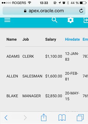
Words are wrapping. You have to scroll horizontally. It's just awkward.
Here's a dead simple CSS tweak that will make your reports mobile-friendly:
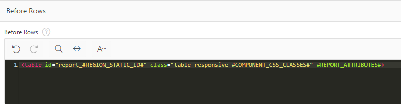
1- Add the class .table-responsive to your table element
<table id="report_#REGION_STATIC_ID#" class="table-responsive #COMPONENT_CSS_CLASSES#" #REPORT_ATTRIBUTES#>
I would recommend creating a template option for it.
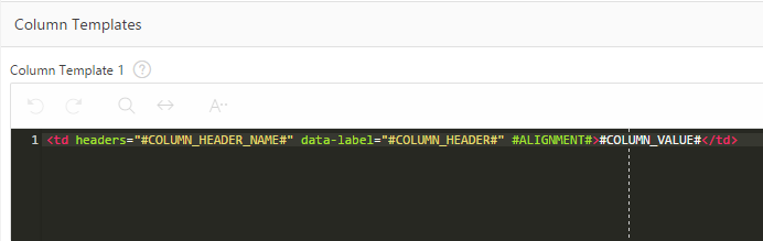
2- Add a data-label HTML attribute to your report template, and put the #COLUMN_HEADER# value in it
<td headers="#COLUMN_HEADER_NAME#" data-label="#COLUMN_HEADER#" #ALIGNMENT#>#COLUMN_VALUE#</td>
3- Add the following CSS to your page/application
@media screen and (max-width: 600px) {
    table.table-responsive thead {
        display: none;
    }

    table.table-responsive tr {
        padding: 5px;
        display: block;
        margin: .5rem 0 1rem;
        background-color: #fff;
        border-radius: 2px;
        box-shadow: 0 2px 5px 0 rgba(0,0,0,.16),0 2px 10px 0 rgba(0,0,0,.12);
    }

    table.table-responsive td {
        display: block;
        text-align: right;
        border-bottom: 1px dotted #ccc;
    }

    table.table-responsive td:last-child {
        border-bottom: 0;
    }

    table.table-responsive td:before {
        content: attr(data-label);
        float: left;
        font-weight: bold;
    }
}
It can be customized to fit your taste, but it gives a good baseline.
Note: It is CSS2 compatible.
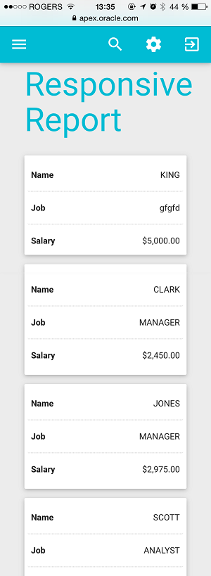
4- Enjoy the result
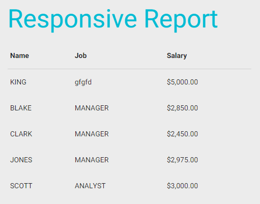
Mobile
Desktop
It'll be part of the next Material APEX release.