Alternative Look for Disabled Buttons

Recently I was told that the disabled buttons in our Universal Theme application were not... disabled enough.
And I have to agree in a way. If that button was the only button visible on the page, it could be seen as the application's default color scheme.
So we added some very simple CSS:
.a-Button.is-disabled, .a-Button[disabled], .t-Button.is-disabled, .t-Button[disabled] {
  background: url(data:image/png;base64,iVBORw0KGgoAAAANSUhEUgAAAAQAAAAECAYAAACp8Z5+AAAAIklEQVQIW2NkQAKrVq36zwjjgzhhYWGMYAEYB8RmROaABADeOQ8CXl/xfgAAAABJRU5ErkJggg==) repeat;
  color: #6a6a6a;
}
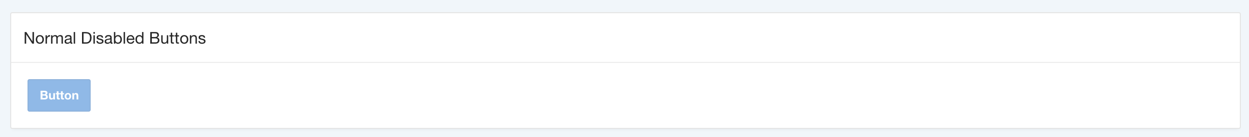
Here's what a disabled button looks now:

There's no way to confuse them anymore.
Demo: https://apex.oracle.com/pls/apex/f?p=113646:1
Enjoy these APEX CSS tricks? Let me know and I'll post more.