Beautifying File Browse Inputs

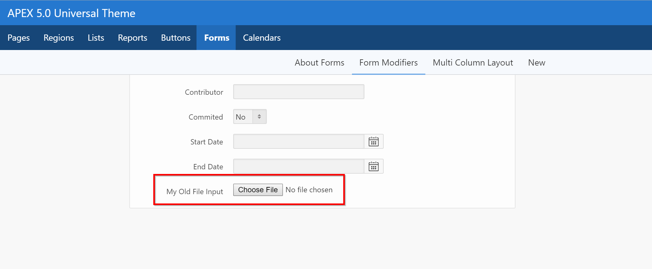
Are you tired of seeing this?

The look and feel behind these <input> comes from the browser itself, so there ain't much you can do...
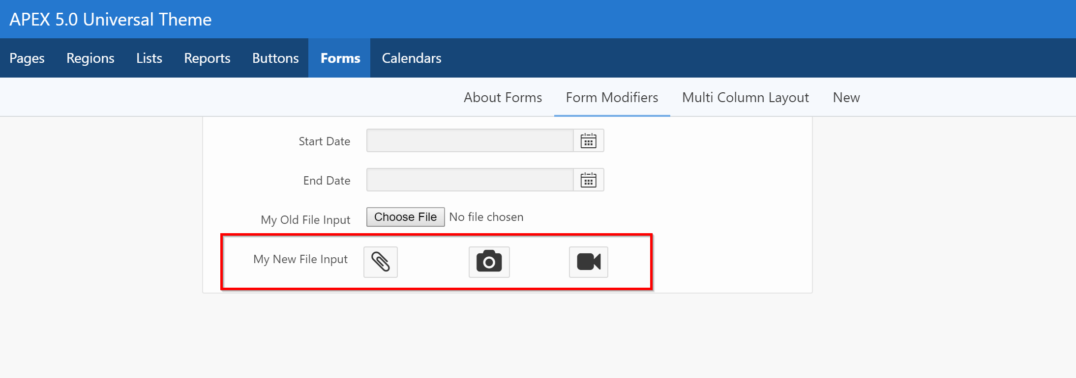
...or is there?
Let's try and work with them a little bit...

* Example above shows 3 file inputs on the same line.
HTML and CSS
So you'll want to create a new Item Template for this. The final code would look like this:
<div class="custom-input-file">
    <label class="a-Button" for="P1600_CUSTOM_FILE_INPUT">
       <i class="fa fa-paperclip fa-2x"></i>
    </label>
    <input type="file" id="P1600_CUSTOM_FILE_INPUT">
</div>
.custom-input-file input[type="file"] {
    border: 0;
    clip: rect(0 0 0 0);
    height: 1px;
    margin: -1px;
    overflow: hidden;
    padding: 0;
    position: absolute;
    width: 1px;
}
No Javascript :)
Step by step with APEX:
-
Add the above CSS somewhere on your page (or ideally in the template or an external CSS file)
-
Copy an Item Template from Universal Theme
-
Change Before Item section:
<div class="t-Form-inputContainer col col-#ITEM_COLUMN_SPAN_NUMBER# custom-input-file"> <label class="a-Button" for="#CURRENT_ITEM_NAME#"> <i class="fa #CURRENT_ITEM_HELP_TEXT#"></i> </label> -
Change After Item section:
#ERROR_TEMPLATE#</div> -
Go to your actual item in Page Designer
-
Add the icon of your choice in the Help Text section. (Example
fa-paperclip)- I added
fa-2xto make the icon bigger - We are using the help text to substitute the icon, so we won't be able to use the "real" help text anymore, but who cares on a
<input type="file">? - From what I've seen, APEX 5.1 will introduce a way to add icons to fields, so we might not need this hack in the future.
- I added
Explanation
In case you're wondering what it does:
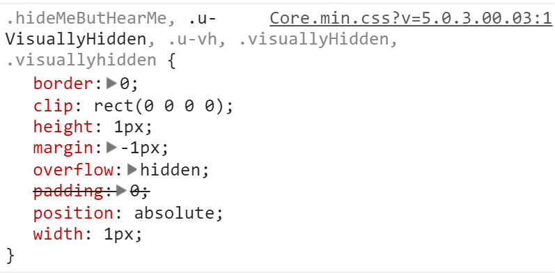
- First, it hides the ugly
<input>with the 8 lines of CSS- The code was taken directly from APEX
core.min.css

- The code was taken directly from APEX
- Then, we are adding the
a-Buttonclass to the<label>element so it looks and feels like a button- You could add additional classes such as
a-Button--hotto change the color
- You could add additional classes such as
- When clicking on the
<label>, it mimics clicking on the input itself, because of theforattribute here:<label for="#CURRENT_ITEM_NAME#"
Let me know if it works for you!