Customizing Theme Roller
I've had the chance to spend time with Shakeeb Rahman at Kscope15 and talk about some of the new APEX UI features.
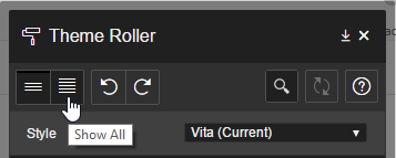
You've all seen it, but here's what Theme Roller looks like as of APEX 5.0.1.00.06:
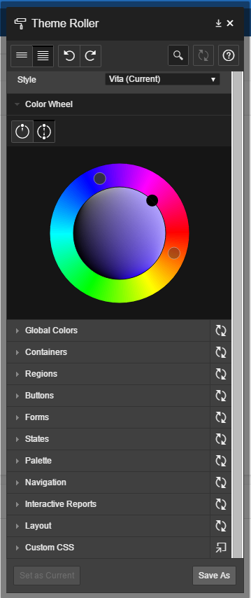
From the beginning I thought Theme Roller was going to be a gimmick... something only usable through the Universal Theme boundaries.
Turns out I was wrong, Theme Roller is 100% customizable.
In the past months, I've been putting a fair amount of time in this theme Material APEX (Demo) (Source).
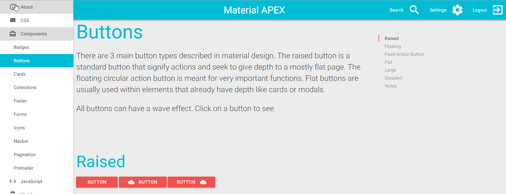
General feedback is positive, but people were struggling with changing the default colors I had chosen (Cyan and Red).
My answer was: You need to manually install the source files and compile the SASS yourself and change the global variables colors...

This was where I lost most people and caused the decision not to use the theme.
The alternative was to batch replace #00BCD4 (Cyan) and #EF5350 (Red) in the final CSS file, but everyone knows this is bad practice...
Here's the secret with Theme Roller
It's configuration is based off a LESS file hidden in the "Theme Styles" attributes:
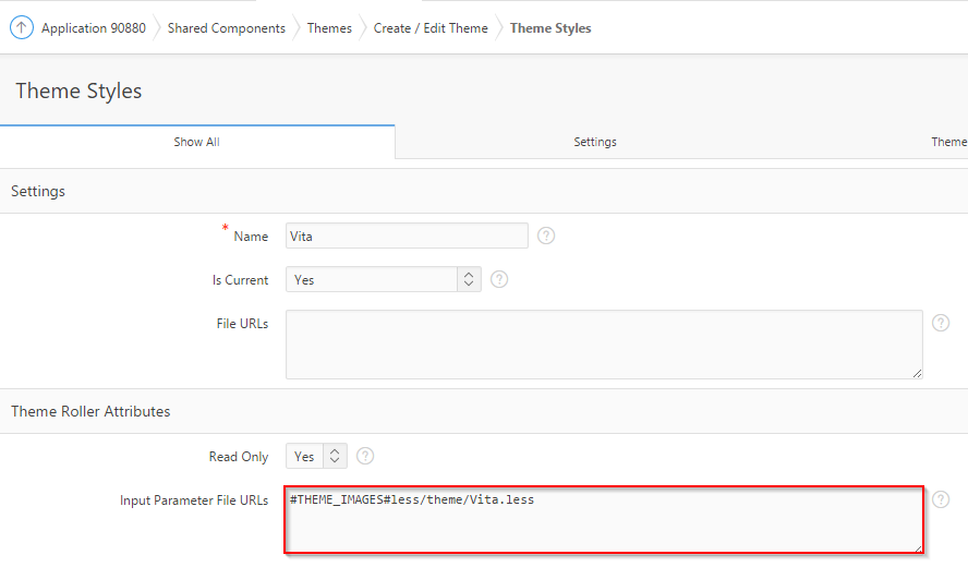
LESS is a CSS preprocessor that allows CSS enhancements such as variables and nesting.
The LESS file is the brain that controls everything that happens with Theme Roller; starting from groups, variables, selectors and finally CSS styling.
Groups
Theme Roller's groups refers to these guys:
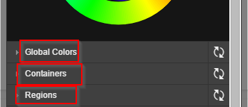
The key thing to understand is that the LESS comment blocks are actually parsed by the APEX engine to generate the Theme Roller groups. So the configuration goes like this:
/*
{
  "translate": true,
  "groups":[
  {
    "name": "UTR.LESS.GLOBAL_COLORS",
    "common": true,
    "sequence": 1
  },
  {
    "name": "UTR.LESS.CONTAINERS",
    "common": true,
    "sequence": 2
  },
  {
  "name": "UTR.LESS.REGIONS",
  "common": true,
  "sequence": 3
  },
  ...
  ]
}
*/
Notes:
- "name" can be a simple String, it will appear in the Theme Roller.
- "common" flag determines if the group is available in the default view
Variables
Again, variables are parsed as LESS comment blocks.
/*
{
  "var" : "@g_Accent-BG",
  "name" : "UTR.LESS.HEADER_ACCENT",
  "type" : "color",
  "group": "UTR.LESS.GLOBAL_COLORS"
}
*/
@g_Accent-BG:                   #2578cf;

/*
{
  "var" : "@Nav-Exp",
  "name" : "UTR.LESS.NAVIGATION_TREE",
  "type" : "number",
  "units": "px",
  "range": {
    "min": 140,
    "max": 220,
    "increment": 10
  },
  "group": "UTR.LESS.LAYOUT"
}
*/
@Nav-Exp:          200px;
Notes:
- In LESS, variables are prefixed with
@. You need to define them in the comment block as well as the variable itself. - "var" can be anything you want. You are going to reference this variable later.
- "name" can be a simple String, it will appear in the Theme Roller.
- "group" needs to match previously defined groups.
- "type" can be:
- color
- number
Styling
Now the variables are ready to be used, you simply need to apply CSS over them.
body {
  background-color:  @g_Accent-BG;
}
Now make it your own!
Here's what the LESS file looks like in Material APEX:
/*
{
  "translate": true,
  "groups":[
  {
    "name": "Global Colors",
    "common": true,
    "sequence": 1
  }
  ]
}
*/

/*
{
  "var" : "@g_primary_color",
  "name" : "Primary Color",
  "type" : "color",
  "group": "Global Colors"
}
*/
@g_primary_color: #00BCD4;

/*
{
  "var" : "@g_secondary_color",
  "name" : "Secondary Color",
  "type" : "color",
  "group": "Global Colors"
}
*/
@g_secondary_color: #EF5350;

nav
,footer {
    background-color: @g_primary_color;
}

,section .header
,.tabs {
    color: @g_primary_color;
}

,.btn, .btn-large, .btn-floating {
    background-color: @g_secondary_color;
}

.collection a.collection-item
,.secondary-content {
    color: @g_secondary_color;
}
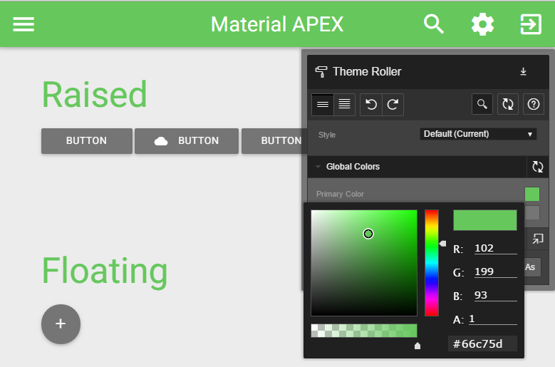
So... people stopped asking about how to change colors...
Important notice: if you are planning on using the Universal Theme for your project, this technique is not recommended because you might not be able to benefit from future updates from the APEX team. You've been warned but I still encourage you to customize your styles!