Material APEX Part 2: The Grid

Most of the components displayed in APEX are built on a grid*, making it one of the most important aspect to understand about a theme.
*Although it's possible to escape grid support in some cases via your page template display points.
A grid is composed of
- Containers
- Rows
- Columns
- Rows
but I will not explain that here...
Nowadays, grids must be responsive so that when you're looking at a 4 column component on a desktop, it adapts to 2 columns on tablet and 1 column on mobile.
We call that breakpoints
A breakpoint usually represents a device size, for instance Desktop, Laptop, Tablet, Mobile, etc. In reality, a breakpoint is just an arbitrary number that determines a possible change in your layout. You can set 10 different breakpoints if you wish. It can be in absolute units like px or relative units like em.
The inconvenient truth
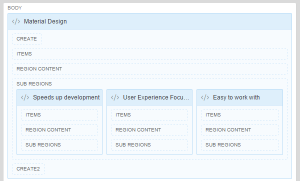
By the nature of APEX itself, developing in the Page Designer forces you to have a "default" breakpoint. What you see in the middle panel of the Page Designer is a representation of your layout for a medium screen:
The fundamental concepts of layout building in APEX like "Start new row" or "Column Span" are limited to one breakpoint only. Of course most of us don't know that because the APEX team has done an incredible job on the Universal Theme to hide the responsive design complexity. Re-sizing the screen looks good on all breakpoints, but that's magic to us developers.
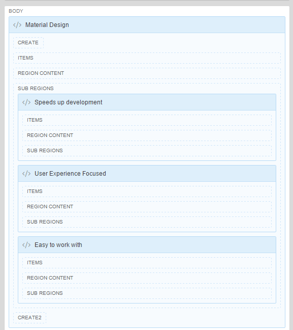
In reality if you look at it on mobile, you're seeing something like:
But we didn't control it. And that's the purpose of using a pre-made theme like Universal Theme or Material APEX.
Making a custom theme is another story.
I don't care about the specifics, how do I use it?
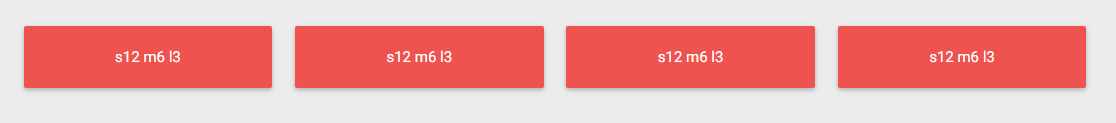
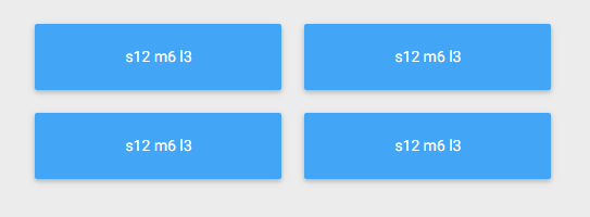
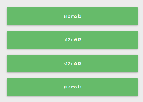
Ahhh... The interesting part. In Material APEX, these are the breakpoints on our 12 columns responsive grid:
- Mobile
<= 600px - Tablet
<= 992px - Desktop
> 992px
Mobile
By default, every component will be set to 12 columns for mobile, meaning that a device under 600px will always have 100% width components.
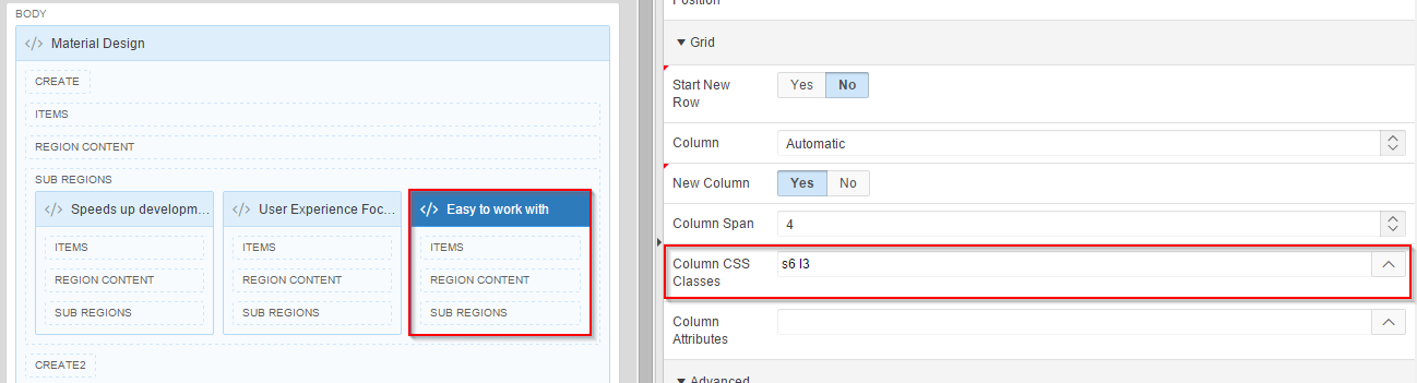
You can override this by setting a sX (s1, s2, s3... s12) value to the Column CSS Classes property. Automatically, the default s12 will be substituted by your new value.
It means you can choose not to bother for mobile and it'll still look good. If you want to spend time enhancing the mobile experience, you might want to override some of these.
Tablet
The "default" breakpoint is Tablet, meaning that all modifications you do in the Page Designer reflects a tablet screen (or bigger).
Desktop
This one is the black sheep. It is not represented by the Page Designer and there is no default value to it.
Why no default value? Because it would be prioritized over the tablet breakpoint, and you definitely don't want that if you carefully designed your pages with Page Designer.
Again, if you want to add additional layout options to desktop breakpoint, just add lX (l1, l2, l3... l12) value to the Column CSS Classes property.
That's it! Not so bad right? Make sure to understand the grid properly before venturing too far into your application's design.
Try Material APEX here.
Download Material APEX here.
This blog post is part of a series.
Part 1: 2015 Status & Statement of Direction
Part 2: The Grid
Part 3: Colors & Styling
Part 4: 2018 Status & Statement of Direction
Part 5: Migrating your existing application (soon)